Link to my animation on youtube, unfinished and would like to re-do some of the timings etc to make it more coherent but it gets the basic concept across at this stage
http://www.youtube.com/watch?v=iqDQf5_qyVo
Tuesday, 18 October 2011
Sunday, 2 October 2011
CRIT REVIEWS: GIFTING
Yumeng Feng:
http://ccarchdesign.blogspot.com/
Yuchen Zuo:
magicmelon.blogspot.com
http://magicmelon3.blogspot.com/ - correct address
Weiwei Kong:
weixiaosecondlife@blogspot.com
http://weixiaosecondlife.blogspot.com/
http://ccarchdesign.blogspot.com/
Yuchen Zuo:
magicmelon.blogspot.com
Blog not found
Sorry, the blog you were looking for does not exist.http://magicmelon3.blogspot.com/ - correct address
Weiwei Kong:
weixiaosecondlife@blogspot.com
http://weixiaosecondlife.blogspot.com/
Wednesday, 28 September 2011
FINAL THOUGHTS ON SL PROJECT AND FURTHER DEVELOPMENT
NOTEPAD FOR THINKING ABOUT HOW THIS PROJECT CAN DEVELOP FURTHER AND BE RESOLVED OVER THE LAST TWO WEEKS:
GIFTING:
THINGS TO DEVELOP AND WORK ON FOR FINAL PRESENTATION:
REACTIVE ARCHITECTURE:
WHY I'VE DONE WHAT I HAVE DONE IN THIS DESIGN AND WHAT COULD BE IMPROVED AND RE-THOUGHT:
-screening, which areas i've screened out and which views i've celebrated and why
-entrances/thresholds - need to think about these, is the entry from the "host" building in real life?
ideas discussed with Ian:
-interior floors and arrangement of spaces needs to be organic too to reflect the exterior, at the moment i've got two separate elements and the interior and exterior need to be cohesive.
-parasitic architecture- look into this idea of the host and the parasite, parasitic architecture responds to the spaces already presented to it instead of just creating what i want instead, use the crevases and small seemingly-useless spaces created where my building meets teh existing building and use them in a productive way to inform what spaces go where in the interior.
-why do i want these "natural" elements, what is actually natural about them and what do they do to a space that i think is so desirable about them, be really specific..
-(need to photoshop images of my building into the actual site to communicate more effectively how it would work)
Judy:
-connections and DETAILS, edges, small subtle elements need to be considered carefully and fit into the overall programme of the building, needs to be relevant and considered.
-be careful of "feature walls", just creating nice textures that don't fit into the programme of the building effectively or practically
-subtle elements, need to integrate effectively. interior and exterior need to inform eachother.
-simulated nature vs "real" nature, can they be just as efective?
-
DEVELOPMENT FROM PREVIOUS WORKSHOP PROJECTS
 |
| MY ORIGINAL MATRIX: PETER ZUMTHOR BATHS AT VALS SWITZERLAND. GOOD FOR ME AND MY INTEREST IN FILTERED LIGHT AND THE IDEA OF LIGHT DEFINING A SPACE. ALSO ZUMTHOR'S USE OF CONTRASTS (LIGHT/SHADOW, HEAVY/LIGHT, HEAVY STONE/EMPTINESS, LIQUID/SOLID) |
 |
| ZUMTHOR BATHS |
 |
| ZUMTHOR SKETCH FOR BATHS, USEFUL FOR THINKING ABOUT MATRIX AND GEOMETRY/PROGRAMME |
 |
| INTERIOR VIEW OF MY LASER CUT PROJECT SHOWING EFFECT OF FILTERED LIGHT ON THE SPACE |
 |
| INSPIRATION: NATURE: LIGHT FILTERING THROUGH LEAVES/TREES ONTO THE GROUND |
 |
| MY LASERCUT PROJECT |
 |
| MY FIRST PROJECT: AUGMENTED REALITY/CONSTRUCTION DETAIL, THE IDEA OF BEING HIGH UP OFF THE GROUND IN AN URBAN AREA AS A FORM OF SAFETY/RELAXATION/ESCAPE IS SOMETHING I CONTINUED THROUGH ALL OF MY PEOJECTS |
IMAGES FROM PREVIOUS PROJECT - ANIMATED DRAWING (SHOWING THE ORIGIN OF THIS DESIGN AND THE DEVELOPMENT)
 |
| initial design for rooftop addition to an existing building |
 |
| futher development of design showing addition actually going INTO the existing building not just perched on top (parasitic architecture) |
 |
| part of my animation drawing showing how i want light to work in my building, filtering through a screen, like light filters through the leaves on a tree to cast interesting shadows on the ground |
 |
| levels on a tree, branches coming out, I was thinking about staggering the levels/floors in my building in this kind of way |
 |
| screen idea in my animation office design in place of a glass sheet |
 |
| vague organisation of space on the mezzanine floor, with open-plan working spaces plus some more private spaces and adaptable areas that can be used in a variety of ways depending on what type of space is required |
SITE
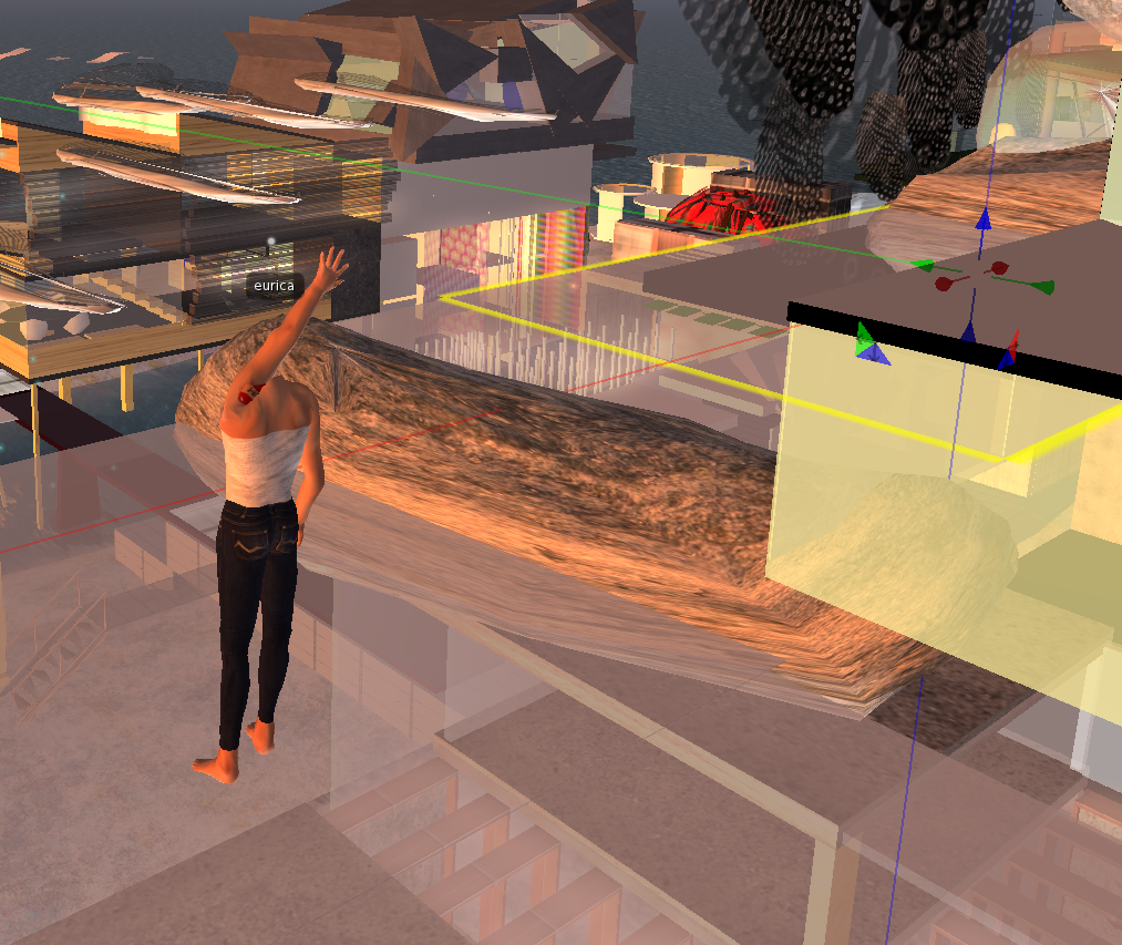
Screen shots of my design in SL before crit day, showing plan, elevation and axo (and relationship to the existing building on which I sited my design- chose for it's similarity to my Auckland CBD site, with sea views on one side, city views on 23 sides and raised off the ground several storeys) . Interior still needs a lot of work and more consideration on how to link the exterior elements with the interior and not just let the exterior define the interior as obviously the functionality of the space will need to define the exterior to some extent.

SCREENSHOTS FROM SL
 |
| changing the sun angle in SL to show light filtering through the screen (doesn't work they way it would in real life, as in casting interesting shadows) but gives a vague idea |


 |
| from underneath rear of building out to sea |
 |
| rear view looking out to sea, can see relationship with my "host" building and the contrast between the organic nature of my materials and the geometric forms of the host building. |
 |
| playing with floor planes, so far left as glass panels but will this will be re-evaluated in the last 2 weeks of semester, a building raised off the ground with glass floors isn't really appealing to me from the point of view of privacy and a feeling of security/solidity. |
 |
| view of building from the sea-side looking through the front glass facade |
 |
| view from the lower floor of my building looking out to sea |
 |
| view from interior of lower floor of my building looking out the side through the moving screen to the urban landscape |
 |
| exterior view of the relationship between the screen and the boulders, this needs to be reconsidered for re-development to make the design slightly more realistic, thinking about the physical details like the connections between the two elements. |
 |
| view from the front of the building looking in to both floors |
 |
| side view showing me playing around with the stairs I created, need to re-think these in the last 2 weeks of development. |
 |
| side elevation showing boulders with moss growing on them plus the 2 floor levels and black moving screen |
 |
| side view showing screen and 2 floor levels |
 |
| interior view showing 2 floor levels plus relationship of boulders to the floor levels, boulders come INTO the building so make up the walls and intrude onto the floor level also |
 |
| composing the arrangement of the boulders and glass blocks for the roof and back wall. |
 |
| side view showing boulders with green roof elements |

 |
| view of "host" building from the opposite side to the side my building is attached to to show how my building can be glimpsed poking out over the top |

 |
| elements from my previous design, organic tree material, use something like this in this design? Interactive elements plus light source plus an element of interest |
 |
| view from the sea showing the relationship of my building to the surroundings, on the auckland CBD site my "host" building had a couple of structures that came between it and the waterfront, and in this case on SL Aaron has built between my building and the waterfront at a lower height which relates to the real site quite nicely. |
 |
| aerial view of my building attached to the host building plus the relationship of both buildings to their urban and topographical surroundings |
 |
| side view playing with floor planes and arrangement. |
 |
| playing with teh "flexible path" controls to get a movement for the screens that is subtle and realistic. Trying to create the movement of leaves blowing in the breeze when there is wind on SL the screens with move gently. |
 |
| second attempt at flexible path settings, this was much better, more subtle settings so that the movement is not so significant that it is distracting to the occupants of the office. |
 |
| glass and rock boulders for roof and the green elements growing on rock boulders act as a green roof in some ways |
 |
| roof from inside of the building, showing glimpses of the sky through the glass boulders plus through the gaps, will look at the gaps in the final development of the project and look at some subtle practical ways to weatherproof the building without compromising the design |
 |
| designing the roof from above |
 |
| organising the screen panels, made a variety of sizes, and transparencies arranged in an irregular, organic way like layered feathers or leaves |
 |
| playing with shapes and textures for the screens |

 |
| elements for the screens (made an alpha channel in photoshop and applied it to a square prim in SO so the screen is really a group of rectangles but appears a a series of leaf-shaped panels. Tried to sculpt the prims in 3DSMax but these prims can't be made flexible in SL so couldn't float in the breeze like I wanted them to. So made the texture in Photoshop using a close up photo of the texture of feathers and selecting the inverse to create this alpha channel |
 |
| initial idea for sculptie for screen with a different feather texture alpha channel applied, too 3D to be practical though, wouldn't float in breeze or look delicate enough. |
 |
| different concentration of the pattern on the sculptie |
 |
| different concentration of the pattern on the sculptie, trying different ideas |
 |
| sculptie using a texture I made last semester as the applied texture, nice organic lines on the alpha channel but not quite the look I need for this project so will make otehrs in Photoshop |
Subscribe to:
Posts (Atom)